Now Reading: The best new typefaces for May 2025 by leading foundries and designers
-
01
The best new typefaces for May 2025 by leading foundries and designers
The best new typefaces for May 2025 by leading foundries and designers
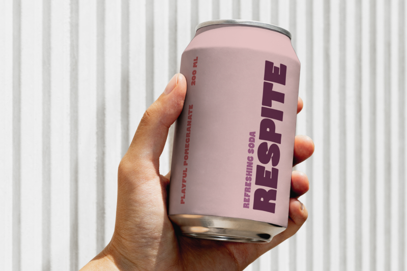
Do you ever feel overwhelmed by the abundance of AI-generated visuals? Luckily, the field of typography remains dedicated to innovation and craftsmanship. The latest releases of typefaces showcase the forefront of contemporary design, from the debut superfamily by Order Type Foundry to a groundbreaking system offering exclusive ownership of typographic variants. These fonts cater to various needs, whether for editorial projects, branding, or cultural references, providing thoughtfully crafted letterforms to spark creativity. This month, font designers once again demonstrate their skill in turning communication’s building blocks into purposeful expressions. It’s the perfect time to refresh your typographic collection.
1. Sita Collection by Order Type Foundry
Order Type Foundry introduces its first superfamily, paying homage to 19th-century Scottish typographic traditions while reimagining them for modern design. The Sita Collection includes Sita Serif and Sita Sans, each offering four weights and corresponding italics. What sets this superfamily apart is its unique approach to connecting serif and sans forms, allowing for optimal harmony when used together in digital or print applications. Sita strikes a balance between historical references and contemporary functionality, making it a versatile choice for cohesive yet varied typography.
2. Union by Big Fog Foundry
Union is a playful unicase typeface recently launched by Big Fog Foundry, featuring chunky letterforms with organic and geometric elements. Designed by founder Brian Dove, this font’s whimsical personality makes it ideal for projects requiring an emotional connection, such as logos, packaging, or comic effects. With its distinct style, Union embodies equal parts fun and functionality, adding cheerfulness to any design project.
3. Lamington by Rain Foundry
Lamington is an organic display typeface by Sydney-based designer Carl of Rain Foundry, inspired by Australian cake lettering. Its carefree spirit and bold shapes make it perfect for lively headlines with personality. For Carl, Lamington represents a return to the joy of type design and creativity, resulting in a playful yet purposeful font that balances fun with thoughtful design.
4. Only Yours by Rosetta Type
Rosetta Type’s Only Yours challenges traditional notions of typeface ownership by offering exclusive variants to single customers. This innovative business model generates unique typographic voices by restricting each variant to one buyer. By redefining digital ownership and originality in typography, Only Yours presents a new and intriguing possibility for designers seeking distinctive and exclusive fonts.
5. Marsam Text by Typonym
Marsam Text is a refined evolution of Evan Deterling’s Marsam slab serif, optimized for editorial applications with improved copyfit and readability. Its semi-condensed proportions and meticulous redesign maintain harmony with the original family while enhancing performance in text settings. With versatility for long-form content and display use, Marsam Text offers a flexible addition to any designer’s toolkit.
6. Intervention by Applied Systems Design Studio
Intervention is a striking display font rooted in early 20th-century Eastern European design, reflecting a balance between historical references and contemporary applications. Originally created for a Prague exhibition, this font’s unique aesthetic makes it suitable for projects requiring a bold and concept-driven typographic voice.
7. Indiana by 205TF
Indiana, designed by Malou Verlomme for 205TF, combines tight proportions with soft geometry and bold decisions for a visually distinctive typeface. Its short ascenders and descenders maximize vertical space efficiency, making it impactful and versatile for modern design applications. With a range of weights and italics, Indiana offers flexibility and expressive capabilities for various design needs.
8. FH Lecturis by Typografische
FH Lecturis, part of Fatih’s renewed catalog at Typografische, draws inspiration from rational grid systems and structural clarity for a neo-grotesque typeface. Balancing precision with human touches, FH Lecturis is suitable for editorial systems and institutional identities, where systematic order meets approachable communication. With a focus on visual clarity and distinctive character, this font offers a thoughtful addition to the neo-grotesque category.
9. ALT Nadrey by ALT.tf
ALT Nadrey, created by Ivorian Coast designer O’Plérou in collaboration with Obou Gbais, contributes to diversity in type design with its contemporary take on 90s poster fonts. Combining rounded letterforms with a sophisticated sensibility, ALT Nadrey reflects personal and cultural identity, offering a unique typographic tool for designers seeking refined elegance with practical application.
10. Sofia Pro by Mostardesign
Mostardesign’s Sofia Pro, a modern classic used by global brands, receives a major update with expanded font options and variable font format. With support for additional scripts and a commitment to environmental causes, Sofia Pro remains a versatile and friendly typeface for contemporary visual communication. The expansion offers unprecedented flexibility while maintaining the font’s welcoming personality, ensuring it continues to be a popular choice in design projects.
