

Now Reading: Selman rebrands the Cathedral of St. John the Divine
-
01
Selman rebrands the Cathedral of St. John the Divine
The largest Gothic cathedral in North America, the Cathedral of St. John the Divine, a significant cultural landmark in New York City, has revealed a fresh visual identity crafted by the Brooklyn-based studio Selman. For Johnny Selman, the founder and creative director, rebranding such a monumental and symbolic space required a hands-on approach rather than relying solely on mood boards. “We believe that being physically present is essential,” Selman stated, emphasizing the importance of experiencing the cathedral firsthand by walking through its doors, exploring the crypt, and observing its grandeur in person.
This immersive strategy influenced every aspect of the rebranding process, shaping elements such as the wordmark, type hierarchy, textures, and color palette of the new visual system.
At the core of the updated identity lies a wordmark inspired by the cathedral’s architectural features, specifically the Pilgrims’ Pavement, a series of ornate medallions crafted from black granite, Belgian marble, and bronze and embedded in the cathedral floor in the 1930s. The Selman team, captivated by the physical connection visitors had with the medallions, captured the letterforms through photography and rubbings, digitizing them to form the basis of the new mark.
While Selman conceptualized and designed the wordmark, Frere-Jones Type was brought in to refine the final design. The collaboration ensured that the new mark effectively bridged the historical and contemporary aspects, making it versatile across different mediums.
Throughout the project, emphasis was placed on legibility, accessibility, and usability, considering that the Cathedral team often utilized Canva for their design work. Tools and templates were developed to support the team in their daily tasks, ensuring that the new identity was practical and functional.
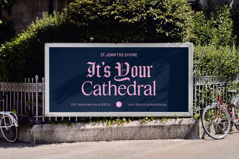
In addition to the aesthetic changes, the rebrand aimed to reflect the Cathedral’s mission as a welcoming and diverse community space, not just a place of worship. The campaign slogan “It’s Your Cathedral” encapsulates this ethos, fostering a sense of belonging for all individuals who engage with the Cathedral.
The rebrand not only celebrates the Cathedral’s rich history but also positions it as a contemporary and inclusive space that resonates with people from all walks of life. Johnny Selman views this project as a collaboration that aligns closely with his own values and upbringing, making it a joyous and fulfilling endeavor.
The visual elements of the rebrand were inspired by the Cathedral itself, creating a sense of familiarity for regular attendees and establishing a visual coherence for newcomers. The positive reception to the new brand has been affirming, with Johnny noting that it has bolstered the Cathedral’s presence and effectively communicated its message. Ultimately, the success of a brand lies in how it is embraced and utilized by the community it serves on a daily basis.