
Now Reading: Rolling with intention: How Super Okay is turning THC Design into the Great American Cannabis brand
-
01
Rolling with intention: How Super Okay is turning THC Design into the Great American Cannabis brand
Rolling with intention: How Super Okay is turning THC Design into the Great American Cannabis brand
In the cannabis industry filled with buzz, noise, and familiar themes, THC Design is standing out by taking a unique approach driven by purpose. The California-based cannabis company, owned by its employees, has recently revamped its brand with the help of New York’s Super Okay studio to position itself for both market expansion and cultural significance.
The company’s goal is bold: to be known as “The Great American Cannabis Company.” This might sound ambitious, but Creative Director Anthony Cappetta fully embraces it. In discussions, they drew inspiration from brands like Levi’s and Coca-Cola, contemplating what it would mean to embody a similar ethos in the cannabis sector.
The outcome is a carefully designed identity reflecting longevity, confidence, and clarity, steering away from the usual stoner clichés and clichéd lifestyle imagery that have long defined the industry. Instead, Super Okay has developed a thorough brand system rooted in THC Design’s fundamental principles: education, accessibility, and a strong dedication to quality.
From a local player to a national contender
Established in 2016, THC Design has established a strong presence in California’s competitive cannabis market. However, with plans to expand nationwide, including a recent debut in Nevada, the company required a brand that could adapt across state borders, regulations, and consumer demographics while remaining authentic to its origins.
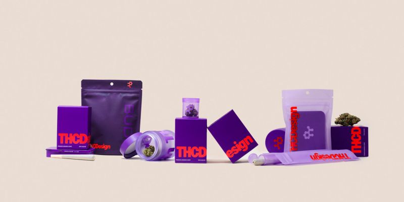
Super Okay was enlisted to refine the brand’s unique molecule logo and introduce a more prominent red logo system, creating a visual shorthand that stands out both online and on store shelves. Centered around THC Design’s distinctive purple hue, now expanded into a range of purples to distinguish product lines, the new color palette is both eye-catching and strategic.
“We aimed to simplify and emphasize a few key elements that we could own,” Anthony explains. “This primarily became the purples and the red. The color combination has the potential to become iconic.”
Blending information with intuition
A notable feature of the rebrand is the introduction of a “bento box” design system – a modular grid utilized across packaging and brand materials to present educational and regulatory details in a clear and clutter-free manner. This serves as a smart solution to address the compliance challenges prevalent in the cannabis industry.
“Compliance is like the wild west,” Anthony remarks. “We created universal packaging that could be used across states to reduce costs. Our labeling system employs the bento box to exhibit consumer, legal, and dispensary requirements in a clear and brand-centric manner, ensuring nothing feels like an afterthought.”
Moreover, the bento box serves as a storytelling tool, enabling Super Okay to deliver breakdowns of terpene and flavor profiles, lifestyle visuals, and brand moments that foster a connection on an emotional level alongside transparent information. It acts as a visual representation of the brand’s multifaceted identity: scientific yet warm, human, and embedded in everyday life.
A tactile brand identity with impact
While the visuals are striking, the materials are equally impressive. The redesigned packaging range includes purple frosted glass jars and transparent mylar bags, conveying a sense of premium quality without seeming pretentious. The consistency across materials and formats contributes to a strong presence on shelves and enhances brand recall, crucial for a product often displayed among numerous competitors.
“The frosted jars and the clear purple tubes and mylar bags were all part of the strategy to claim purple as our brand color,” Anthony elaborates. “The clear and consistent color strategy is what conveys our value proposition. It’s sophisticated yet welcoming.”
Even the user experience of the packaging was carefully considered. Adaptable tops, universal boxes, and modular label placement make the brand intuitive for consumers and efficient for dispensaries navigating diverse state regulations.
Honoring tradition without the clichés
Cannabis branding has typically leaned towards either nostalgic themes or futuristic aesthetics. However, THC Design’s new identity carves a unique path, drawing upon American brand legacy without relying on outdated cannabis references or tired visual motifs.
The tone is self-assured yet not arrogant, with messaging that is informative yet not preachy. While the brand acknowledges its California roots, especially in lifestyle imagery, it doesn’t confine itself to those origins but instead focuses on potential.
“We didn’t want to appear too grassroots because that didn’t reflect who we are,” Anthony notes. “We did aim for some of the photography to exude a California vibe, but it’s about the consumer seeing themselves in that, not the brand aggressively showcasing it.”
Crucially, THC Design’s structure as an employee-owned company and its values are woven into the brand narrative. Rather than presenting itself as just another startup capitalizing on cannabis, the brand emphasizes purpose, accountability, and longevity.
“There are not many companies in the cannabis industry with this level of intentionality and commitment to their employees,” Anthony emphasizes. “It’s a significant differentiator and value proposition, to the extent that we highlighted it on our packaging.”
Designed to endure
While aesthetics are important, it’s the underlying structure of the brand that gives THC Design its resilience. From flexible packaging to scalable visual systems, each element has been crafted to evolve alongside the business.
The new identity has already boosted repeat purchases and made a mark in Nevada, where the brand debuted strongly. According to THC Design CEO Marlon Coburn, the rebranding process went beyond just visual changes.
“Through our discussions, we refined our visual identity and our core narrative, honoring our legacy while defining the next chapter of our company,” Marlon shares. “The rebrand wasn’t just about looks; it was about capturing the essence of our evolution.”
Despite the lingering stigma around the cannabis industry, the focus is on building trust. This is why flashy tactics won’t suffice. Instead, brands need to educate consumers and establish brand integrity from within.
“You provide people with information that enhances their experience,” Anthony suggests. “And most importantly, you do what THC Design is doing – you invest a great deal of care in the quality and consistency of the product itself.”
What lies ahead?
As more states legalize cannabis and the industry matures, branding will play a crucial role in differentiating long-term players from short-lived trends. Anthony envisions the future of cannabis branding not in nationwide dominance but in thoughtful, regional storytelling and a deep respect for craftsmanship.
“Be the premier brand in the Southwest and focus on the cannabis culture there,” he advises. “More emphasis on the design craft and maintaining brand consistency will be vital. Those who endure, show up consistently, and make an impact will succeed.”
If THC Design is any indication, the era of cannabis brands being seen as mere novelties is waning. With its refined identity, adaptable system, and bold aspirations, the company is not just following trends; it’s setting them.