Now Reading: How Liverpool FC’s rebrand was powered by its fans
-
01
How Liverpool FC’s rebrand was powered by its fans
How Liverpool FC’s rebrand was powered by its fans

Liverpool FC has made history in English football by winning the Premier League title for the second time. Combined with their 18 top-flight titles from before the Premier League era, they now share the honor of being crowned English champions 20 times with Manchester United.
Another significant development at Anfield this year is the collaboration between brand agency Bulletproof and Liverpool to create a unique football identity powered by fans. This partnership aimed to capture the energy and unshakeable belief that define both the club and the city. David Beare, executive creative director at Bulletproof, highlighted the involvement of fans in shaping the new identity.
The rebranding project focused on balancing tradition and innovation, with the Liver Bird symbol being a central element. The design was influenced by the Liver Bird’s history, symbolism, and role as a representation of defiance, passion, and heritage. The visual system, inspired by the Liver Bird’s wing expression, reflects the energy of Anfield and Liverpool.
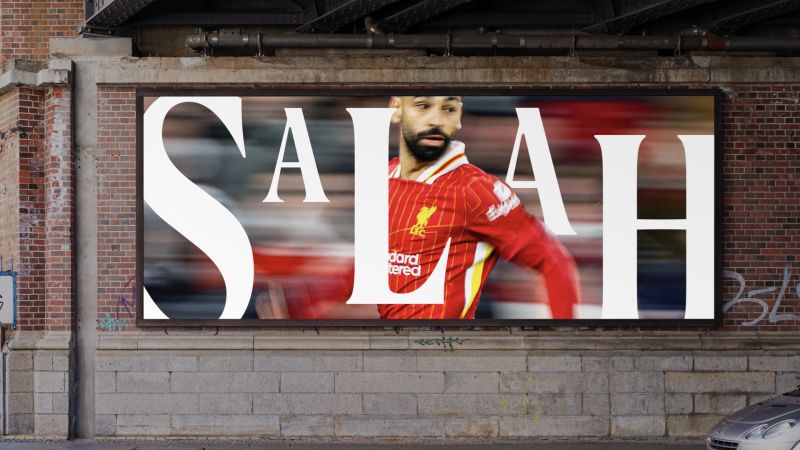
The rebrand not only represents the club but also embodies the spirit of Liverpool, showcasing characteristics like graft, faith, and togetherness. Typography plays a central role in the evolved identity, with custom serif and sans serif inspired by the Liver Bird’s shapes and curves. The flexible design is intended to cater to a global audience and adapt to various contexts, including match days and digital platforms.
The success of the rebrand will be measured by the emotional connection it builds with supporters, aiming to resonate with fans on a deeply human level. This fan-powered revolution represents a visual refresh that amplifies what makes Liverpool unique, emphasizing the importance of the connection between the team and its supporters in modern football.


